Designer soapbox: Anja Wohlstrom
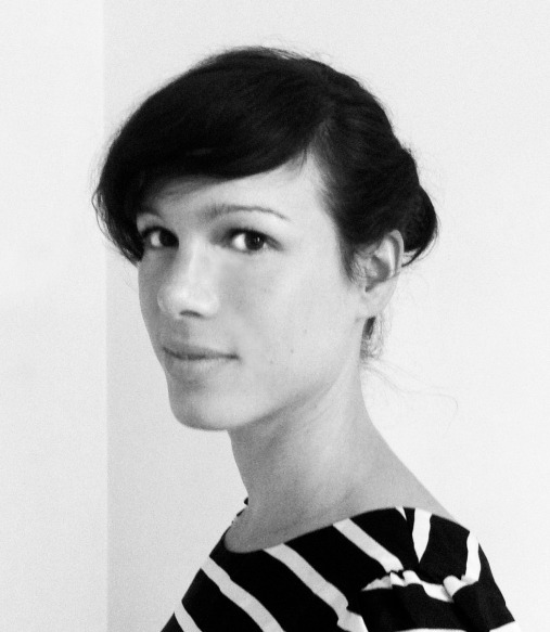
Anja grew up in the Swedish countryside outside Helsingborg, near Copenhagen. Now Art Director of the New Statesman, she steps onto the Designer Soapbox to talk about her love of illustration, the Swedish design aesthetic and having ideas in airports.
What’s your day job?
As the Art Director of the New Statesman magazine, I’m responsible for the overall look of the magazine. I work with my team of picture editors and designers to design the magazine and get the right ‘pace’ and balance of text and images across the magazine as a whole.
What do you like to do in your spare time?
I really like the arts scene in London. It’s amazing, compared to Sweden, because there are so many places to visit. I recently went to see the new tanks at Tate Modern. It’s a great space.
I’m trying to find time to work on some personal projects as well. I have loads of ideas but don’t seem to be able to find the time at the moment!
What do people get wrong about you?
Although I tell them that I’m from Sweden, people tend to mix it up with Switzerland. And of course spelling my name.
What do you appreciate about the Swedish design aesthetic?
Swedish design is very clean, light and airy in everything from architecture to graphic design. That’s something I like in design – clean lines and white space combined with great ideas.
Rodeo magazine celebrates Scandinavian creativity; its creative director is Stefania Malmsten. Swedish design duo Studio Yra do great products inspired by typography that I really like, and of course I’m also a big fan of the classic Scandinavian furniture designers. I admire some Danish design studios, too, like Hvass & Hannibal, for their colourful, simple graphic designs.
What first inspired you to become a designer?
I always wanted to be an artist when I was growing up, but my parents thought I should get a proper job. So I studied physics and maths A levels, then moved to London and met a graphic designer. I thought, ‘That’s interesting – it’s like being an artist, but it’s a real job.’ So I did a foundation in graphic design at LCC, then studied editorial illustration as part of an BA LCC course in Graphic Media Design.
How did you find your first job?
During my degree I did lots of internships with design companies, including a freelance role with a company called Itchy Media which turned into a full-time job. Then I worked as a graphic designer at Time Out.
How did your career develop from there?
Three years ago, I went to the New Statesman as Art Editor, then became Art Director two years ago.
What do you love about your job?
I love that it’s a weekly magazine, so things move quickly and you really have to think on your feet. I find that quite exciting. It’s great to work with really bright, interesting people – writers and journalists. And personally, I’ve learned a lot about politics. I’ve re-designed the New Statesman website and I’m working on a new iPad app and it’s great to be able to design on different platforms for a magazine. I’m really exited about the opportunities for editorial design on tablets and within digital design.
How do you decide which images to use?
Sometimes the editor will have a very clear idea of what needs to be visualised. Other times, we’ll choose an image or layout that goes with the particular headline or type of article. It’s all about looking at the magazine as a whole. To get the best pace across the magazine, we work closely with the editorial team.
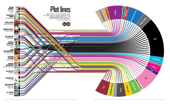
Infographics have become really fashionable in the last couple of years. They bring something new; you can visualise quite hard-to-understand topics in a really simple way.
For other pieces, a good illustration by someone who can really draw adds so much value. I try to use illustration for the cover when it’s suitable. I work with one artist, David Young, who paints very realistically, which works really well for humorous political subjects and offers a fresh alternative to cartoons. With artworks like David’s illustrations, you can see that they took time and they have that human element that you can connect to which I think adds value. There are so many talented illustrators out there and the world is pretty small, but with email we have the opportunity to work with people around the world which is really exciting.
Which other magazine art directors do you admire?
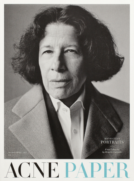
I really like Italian IL magazine, art directed by Francesco Franchi. It has a bold design which feels current. Bloomberg in New York do exciting things like using graphics throughout the whole magazine. Acne puts together a beautiful magazine every six months on newsprint. THE GERMANS is a magazine that launched last year that looks really good. Another favourite is Apartamento, a Spanish ‘everyday interiors magazine’ that is full of great articles. The format is like a small book with really organic layouts – I think it’s really lovely.
What do you like about working with writers?
I really enjoy working with journalists and writers, and have learned a lot working on the New Statesman. Sometimes there’s almost no contact with a writer, other times there’s a lot. It depends on the writer. Some have very strong ideas and want to be involved with the choice of visuals, and it’s always fun when a writer is engaged and wants to contribute ideas.
What drives you mad about writers?
It can be frustrating when a journalist has written too much and doesn’t want their work cut!
What do you think about the trend towards long forms of writing?
The print version of the New Statesman features articles several thousand words long, and I think there’s a need for long articles that are a counterpoint to the quick, short pieces people read online. They’re the kind of thing you want to read on the sofa on a Sunday afternoon – longer printed articles can really expand on ideas. I’m interested in a quarterly magazine called Delayed Gratification, a ‘Slow Journalism’ publication, which is all about taking a slower look at news, months after the event.
What’s your favourite gadget?
I use the Next Bus app a lot. Does that count?
What’s your favourite place for creative inspiration?
Waiting in an airport is good because you have time in between two things. I quite often find myself drawing ideas on the back of the boarding card.
Who’s your design hero / heroine?
George Lois changed the idea of magazine covers in the 60s and his covers for Esquire are great. Some of the East European designers like Roman Cieslewicz are very inspirational as well.
What’s your favourite book?
‘Things As They Are – Photojournalism in context since 1955′. Photo essays are presented in the original context of the magazine that they were published in, so it’s really interesting in regards to layouts.


