How to win a D&AD Writing for Design award
How to win a D&AD Writing for Design award
Last week a clutch of copywriters gathered in the basement of the Truman Brewery to judge the D&AD Writing for Design category. Led by foreman Nick Hynes, our jury included Ben Afia, Katie Ewer, Dave King, Afy Nou and Claudia Ruane.
We’d been instructed to be both tough and generous in our judging. Tough because those awards should be hard to win, but generous enough to appreciate that an idea can show a spark of brilliance, even if it’s not completely realised.
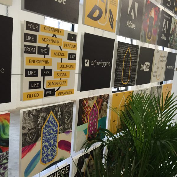
It was chilly down in that basement, but we kept warm by powering up on caffeine and doing laps around the long tables where the 100 or so submissions were laid out. The first round of judging took place in silence, as we went round and tapped in ‘yes’, ‘no’ or ‘abstain’ on our special D&AD judging ipads.
In the afternoon, we gathered together and discussed the shortlist. It was fascinating to listen to each others’ reasons for liking or disliking a particular piece of work. The other judges’ opinions made me discover hidden depths in some copywriting I’d dismissed and hidden shallows in other work that I’d originally liked.
So who won?
You can see a preliminary list of pencil winners here, but the full results are under wraps until 19 May. In the meantime, here are a few tips if you want to win one of those coveted D&AD pencils next year.
1. Enter the awards
One of the frustrations of being a judge at these awards is knowing how much great work is out there that isn’t submitted. If you’ve worked on a copywriting project that feels fresh and original, please enter the awards.
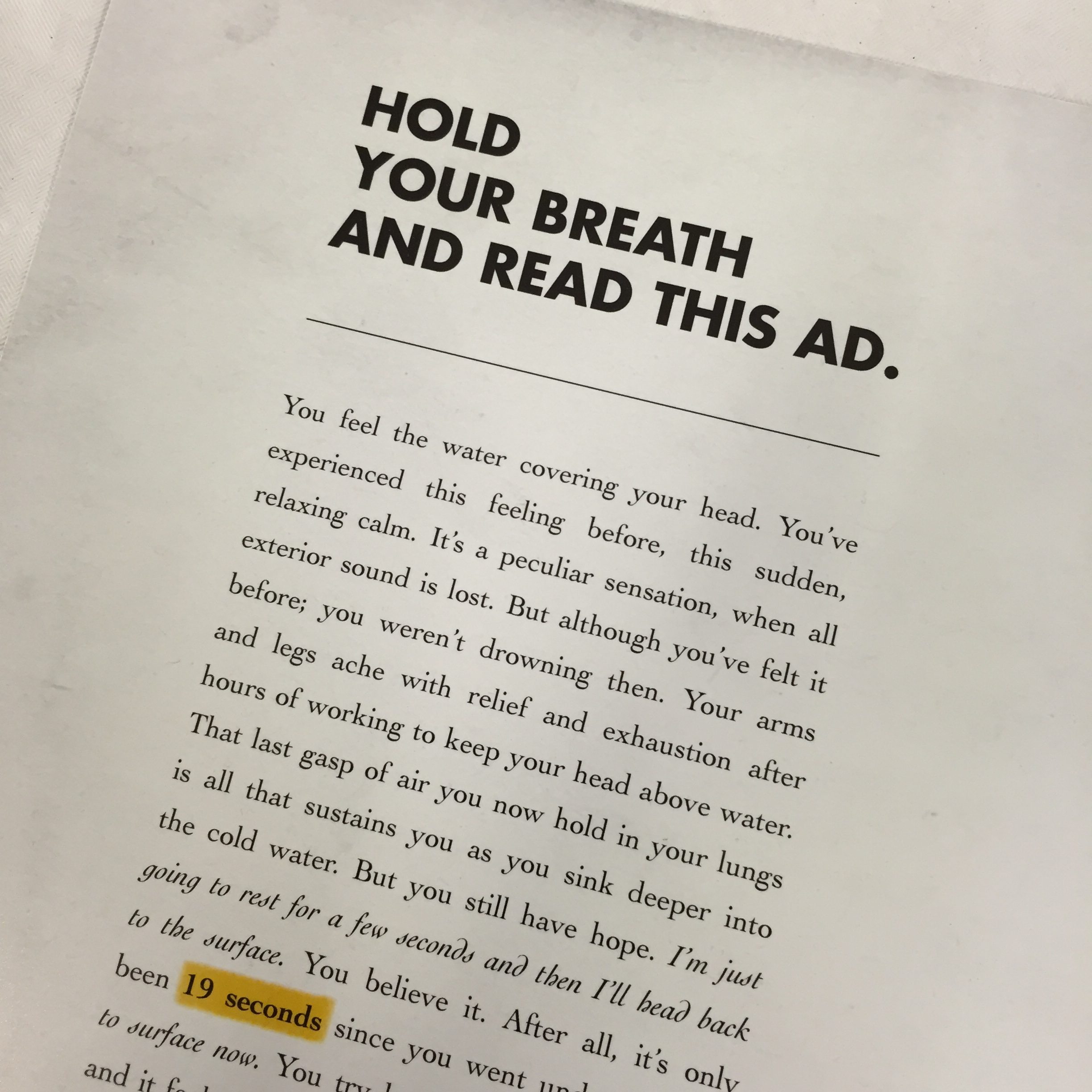
It takes 87 seconds to drown. The same
time it takes to read this ad.
2. Deliver a visceral punch
Everyone on the panel loved the ‘Hold your breath’ advert by CLM BBDO Paris for Guy Cotten lifejackets. The headline instructs you to hold your breath while you read the poster, which should take around 87 seconds. If you were underwater without a lifejacket, in this short time you would start to lose consciousness and your brain would start to die. Time checks were dotted through the length of the advert, which described the different stages of drowning and the thoughts that might run through your head as you panic and gasp for air, but take in only seawater.
This was such a clever concept, perfectly adapted to the poster form and the product it was advertising.
3. Talk up to your reader
Ads aimed at older people can be dispiriting, assuming that once someone hits retirement age their universe contracts until their sole interests are wide-fitting shoes and stairlifts. The print ads for Pegasus Life buck this trend with intelligent long-form copy that draws a picture of an active, engaged life that expands to embrace new horizons in old age. The length, pace and form of the copy are a natural fit for the target reader and there’s not a stairlift in sight.
4. Avoid chatty cliches
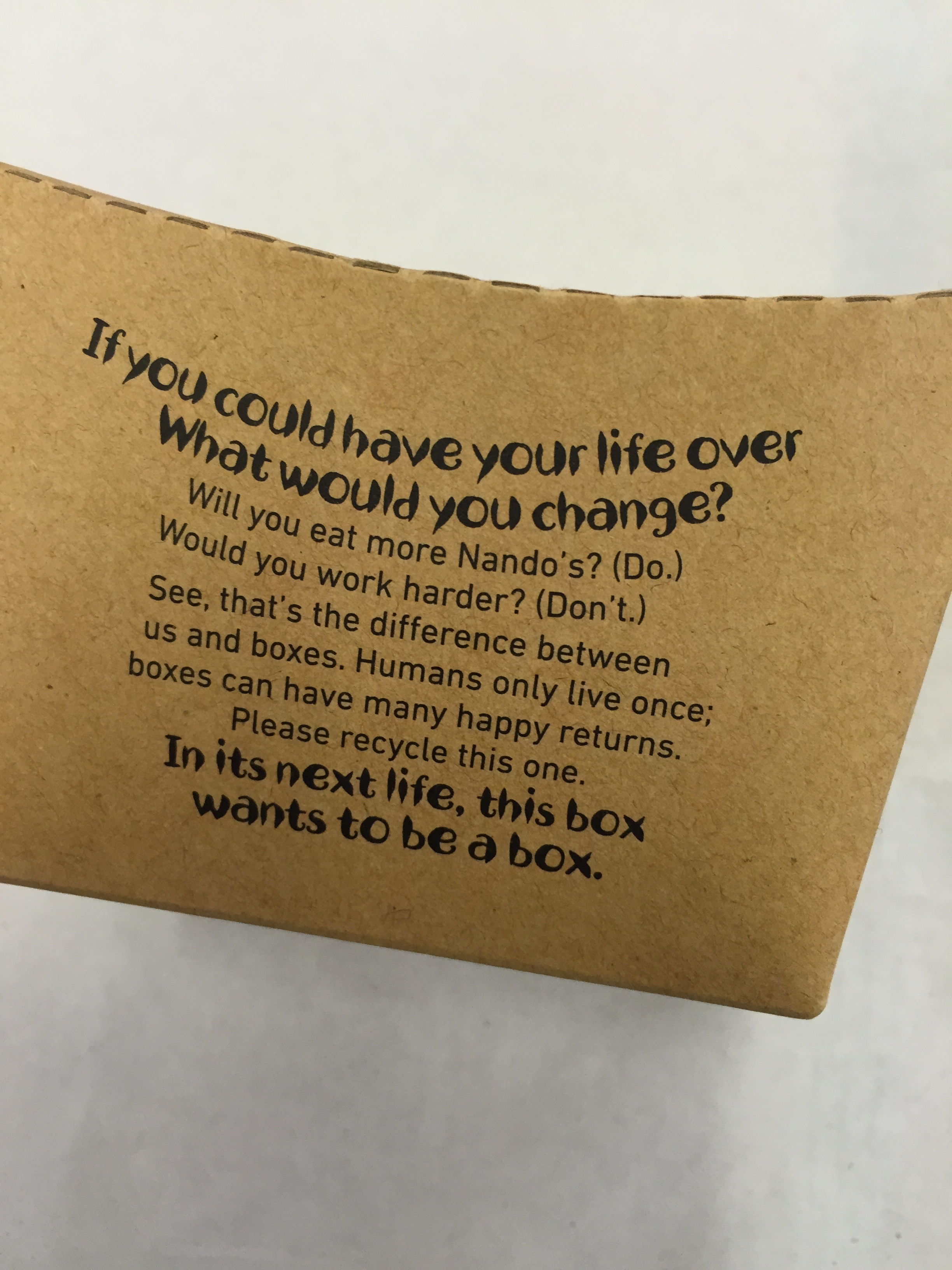
Copy from Nando’s that’s engaging without being annoying
The current rash of overly chatty copy has a lot to answer for. As Katie Ewer, one of this year’s Writing for Design judges, wrote in The Drum, “So many brands are talking to me that I can’t hear anything at all.” There’s a fine line to tread between connecting with customers and coming across like an over-enthusiastic labrador who won’t stop pawing your knee.
Nando’s have managed it, though, with pack copy that’s pithy, engaging and informative. See the message on this box, with a question that draws you in: “If you could have your life over, what would you change?” Readers with a short attention span can skip to the end: “In its next life, this box wants to be a box.” The copy conveys the recycling message simply and concisely, without covering your clothes in pawprints.
5. Make us smile
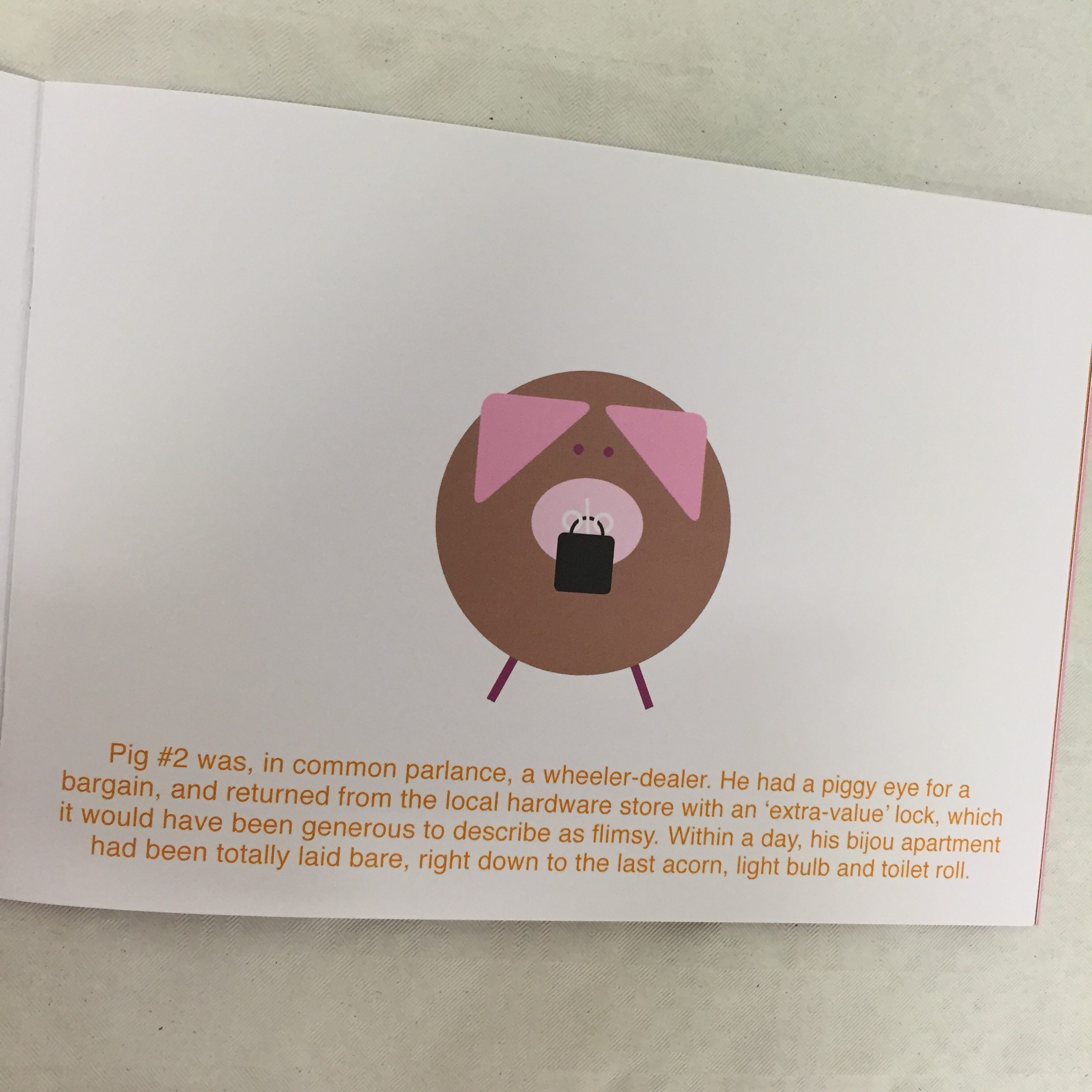
Jim Davies reinvents the fairytale for the 21st century with Three Little Capitalist Pigs
Argos scored a surprise hit with packaging copy by The Partners for its Simple Value range. Big, bold words stood out on bright red boxes, drawing you in with tiny vignettes and delivering a free smile to accompany these low-cost items. The mirror box says: “Dress. Check. Change. Check. Leave.” The microwave says: “Heat. Ding. Done.” Consistently entertaining.
Other writing that hit our funnybones included the Ben and Graeme annual, iZombie’s Guide to Surviving among the Living, and Jim Davies‘ reworkings of fairytales for the 21st century. In Little Red Livelihood, the heroine hacks her way through terrifying thickets of business jargon in a witty take on the Grimm Brothers story.
6. Make us think
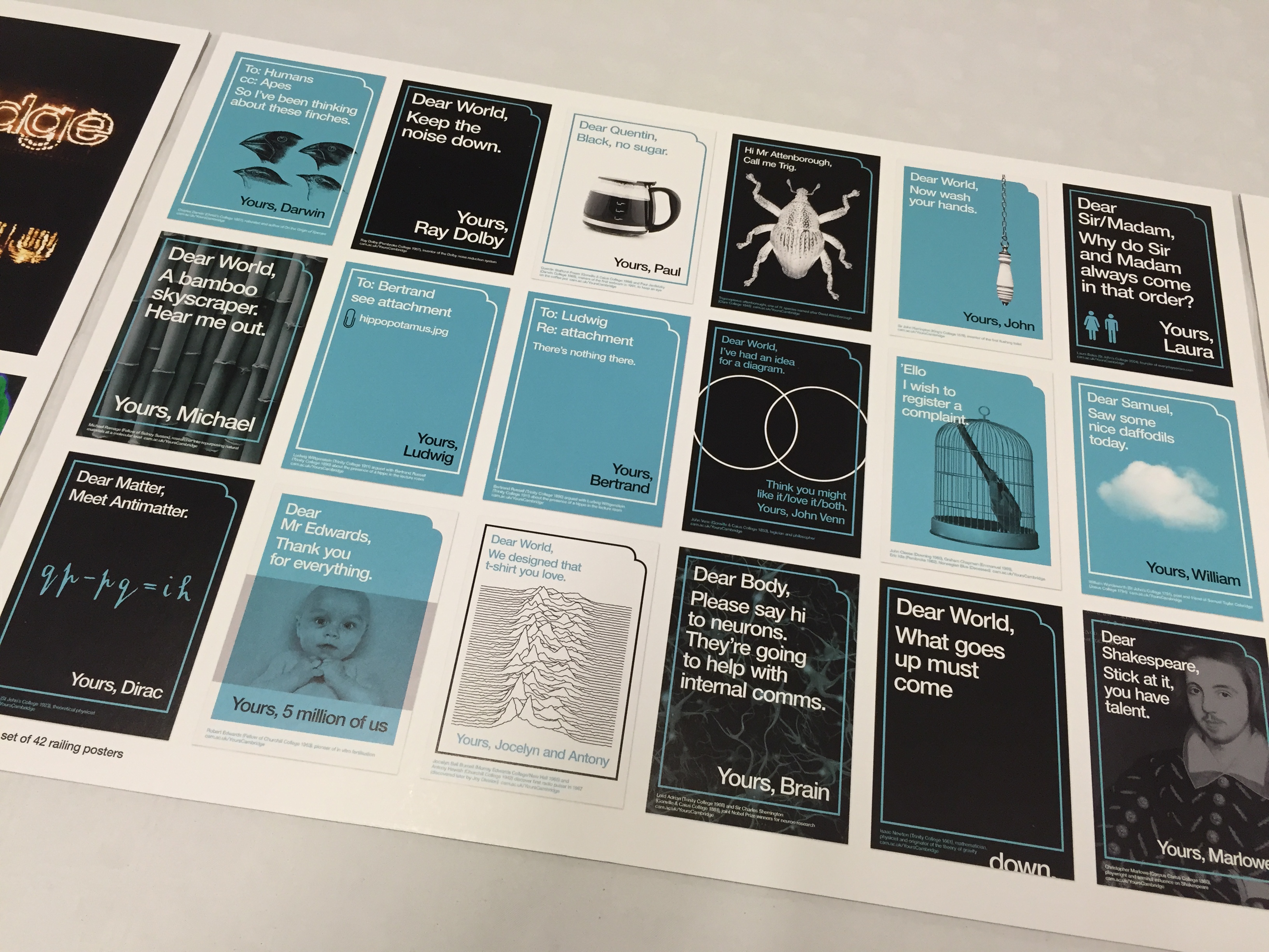
Clever copy for Cambridge. No surprise Nick Asbury was involved
Johnson Banks‘ fundraising campaign for Cambridge University hit every target: the idea, execution and relevance were all spot on. The concept was a letter to the world, illustrating some of the stellar ideas that Cambridge academics have brought into being over the last 800 years.
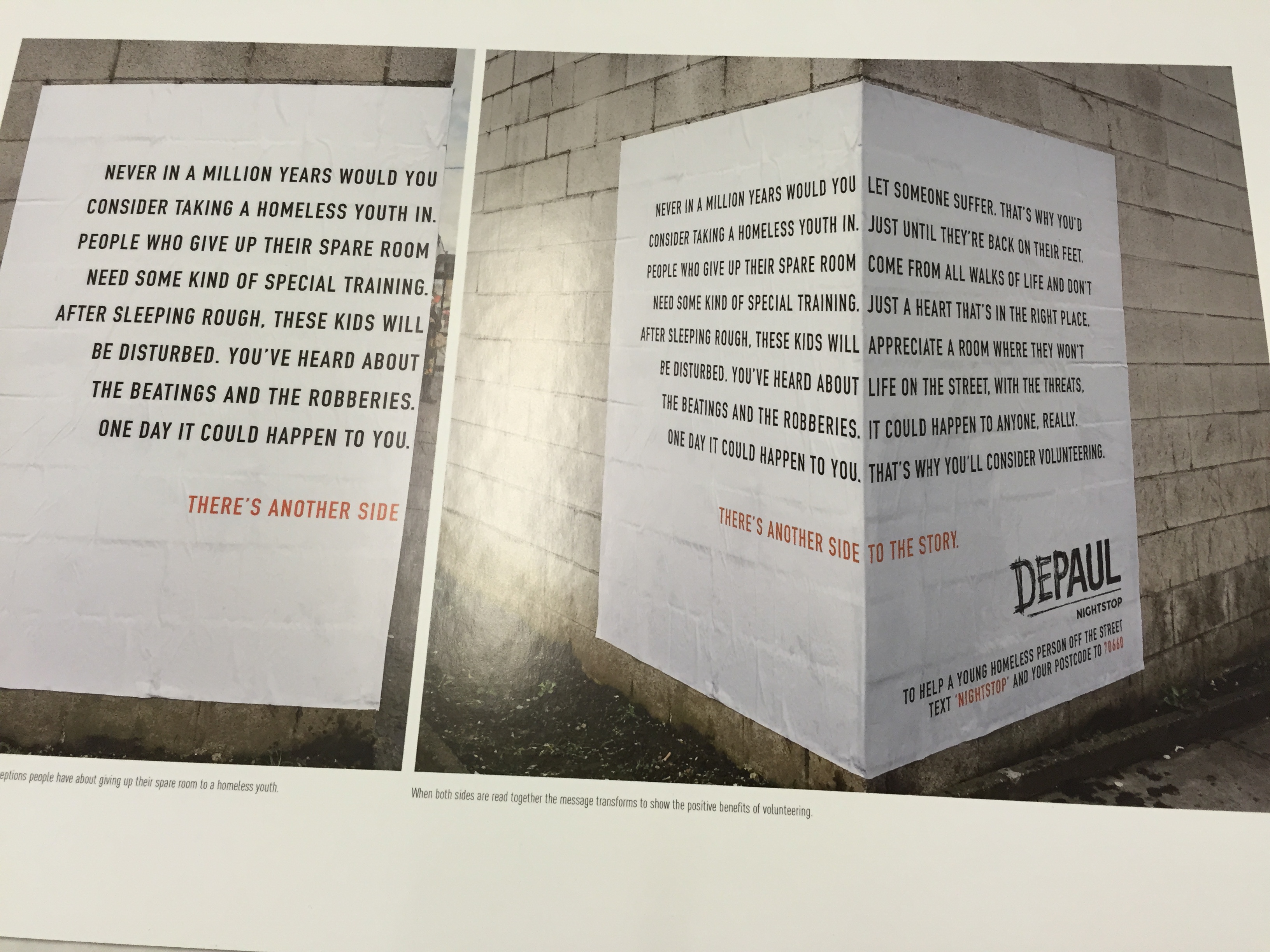
See two sides to homelessness with this poster for Depaul
On the left you can see some of the railing posters, including one inspired by Jocelyn Bell and Antony Hewish’s diagram of radio waves, adopted by Joy Division for their Unknown Pleasures album. Clever and intriguing, the campaign made us stop, think and think again.
Another award entry that got those brain neurons sparking was the Publicis ‘There’s another side to the story’ poster campaign for Depaul, a youth homelessness charity. Seen from one side of the wall, these are invective-filled rants against the homeless. Turn the corner and the full story unfurls, encouraging people to give a young homeless person a bed for the night. Thought-provoking and effective.
7. Take our breath away
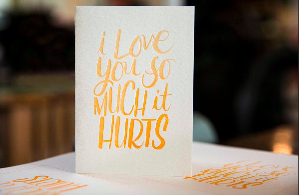
Valentine’s cards against domestic violence by Australian agency, Joy. Copywriter: Roy Leibowitz
‘I love you so much it hurts’. ‘You knock me off my feet’. ‘I ache for you’. These hand lettered words appeared in delicate pastels on a range of cards released for Valentine’s Day this year. Turn the cards over and you discover they’re in aid of an Australian charity, Domestic Violence NSW. The copy on the back reads: ‘For one in three Australian women, the statement on this card isn’t a metaphor. They experience physical violence at the hands of someone they know.’
The words are devastatingly effective. Their meaning flips 180 degrees once you hear them as the words of a woman who’s suffered domestic violence, rather than as messages of overblown love.
Copywriters on copywriting…
You might also like:
-
- Jury foreman Nick Hynes urges copywriters to enter the awards.
- Katie Ewer on crimes against the written word.
- Anelia Varela on how not to win a Writing for Design award.