Snapshots from D&AD Writing for Design 2018
It was a sign. On the street leading up to the Truman Brewery in East London, there was an empty Argos microwave box bearing the slogan ‘Heat. Ding. Done.’ This clever packaging project won a D&AD Writing for Design award two years ago, the last time I was on the panel.
I kept an eye out for other winning copywriting projects. Maybe I’d see some Nando’s packaging or a copy of Fucking Apostrophes balanced artfully on a bollard? No. Just an early-morning queue of vinyl obsessives stretching from Rough Trade East to the car park behind the old brewery building.
But enough of bollards and boxes. What went on at this year’s D&AD Writing for Design awards? Here are a few snapshots from behind the scenes.
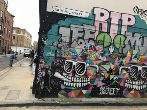
Mandatory East London graffiti shot
Talented bunch of copywriters
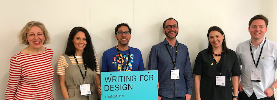
First of all, a shout out to the brilliant bunch of copywriters who were on the panel. In the picture above, I’m on the far left, next to Leona Ford, Head of Copy at Moo.com, Rishi Dastidar, Head of Verbal Identity at BrandPie Limited, Ben Blench, a freelance copywriter based in Amsterdam, Hayley Redman, Senior Copywriter at Innocent, and Neil Martin, Creative Director at First Word.
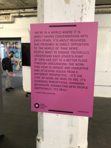
“The work this year is honest and disruptive.” Leona Ford’s words on display at the D&AD exhibition.
This year, there were fewer entries than before. Possibly it’s because some of the big agencies are cutting back on entering awards. Publicis didn’t enter anything this year, while WPP is having a post-Sorrell wobble at the moment. Maybe freelance copywriters don’t want to shell out on the entrance fees or perhaps it’s Brexit blues.
Who knows? Whatever the reason, there were still some excellent submissions and worthy pencil winners. Here’s a quick overview.
Winners in the Writing for Design category
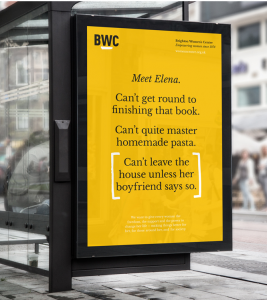
Baxter and Bailey’s work for the Brighton Women’s Centre
Everyone on the jury loved the powerful posters for Brighton Women’s Centre, written by Kate van der Borgh for Baxter and Bailey. Working the rule of three principle with a neat twist at the end, the campaign was a deserving winner of a graphite pencil.
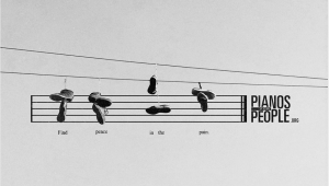
All the World’s a Song: the Pianos for People campaign won a wood pencil for Rodgers Townsend DDB
Pianos for People is a St Louis-based charity that connects people who need pianos with pianos who need people. This engaging idea took poetic language for a walk along musical staves, in an unusual, understated approach.
From work for charities to unashamedly commercial copy for Ford Ranger in New Zealand. How do you get people in love with their 4WD to give their vehicle up for a new model? You create a witty break-up guide, including sections on the healing process, uplifting songs and, finally, a voucher for a discount on a new model.
The GO Etiquette Book also earned itself a wood pencil. Tasked with encouraging Canadian commuters to behave in a more seemly manner, DDB Canada produced an entertaining guide that balanced serious points with ridiculous flowcharts. (Are you the driver? Drive the bus.)
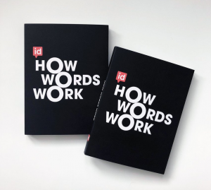
Want to convince a CEO to invest in copywriting? Drop this on their desk.
There seemed to be fewer self-promotional entries than in other years. Due to that collective drain on cashflow? But one notable entry was How Words Work by Verbal Identity Ltd. This book argues persuasively for the value of words in business, succinctly expressing why it’s worth investing in good copywriting to promote your brand.
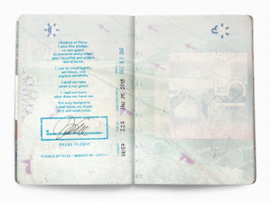
Every visitor to the Republic of Palau now receives this stamp in their passport
The Palau Project’s mission was to discover a way to protect the tropical island paradise of Palau from the casual, unthinking environmental harm caused by visiting tourists. The solution was the Palau Pledge, a passport stamp that combines poetic language with a down-to-earth message. Now, every visitor signs a pledge in their passport to protect these beautiful islands for future generations. Simple, memorable and effective, these words have impact. Copy by Daniel Fryer of Leo Burnett and Paul Bootlis of Host Havas, Sydney.
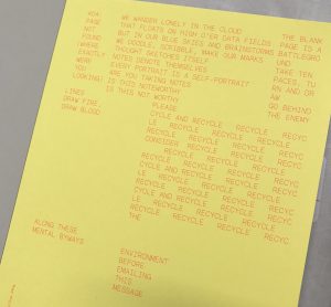
Words in a paper trail, for Arjowiggins
The final pencil winner was Paper Wraps Stone, a promotional notebook for Arjowiggins Creative Papers, written by Nick Asbury for Studio Build. Nick is known for his love of poetry and, here, scraps of a poem about paper pop up on different pages, resolving into a full-length piece at the end. I loved the phrase “We wander lonely in the Cloud that floats on high o’er data fields”. An unusual approach that draws readers in and highlights the virtues of a product that’s often taken for granted.
What makes a winner?
- Above all, it’s work that makes the judges think “I wish I’d done that”.
- Copy that really sings with the design, where both elements are fundamental to the success of the work.
- A new idea, often something that seems obvious now it’s in front of you.
- Work that’s rooted in genuine customer insight and speaks to a truth about the product. (E.g. The pain that Ford Ranger owners feel when faced with letting go of their beloved Ute.)
- Copy that draws you in, then subverts your expectations.
What doesn’t make the grade?
- An idea we’ve seen before. (E.g. a poster that reads backwards and forwards but is nowhere near as clever as There’s Another Side to the Story.)
- Work that isn’t consistent. (Two brilliant posters, followed by two that are underwhelming.)
- Copy that isn’t relevant for its intended audience. (In-jokes that might appeal to people in marketing or design, but won’t connect with customers.)
- Work where the concept is better than the execution.
- An idea that goes so far, but not far enough.
Next year?
Good luck if you decide to enter next year. If you do, you can guarantee that your work will be appreciated and scrutinised from every angle by a diverse group of copywriters who love the power of words as much as you do. In the meantime, I leave you with a picture of Dexter the dachshund, who famously works at SO Creative Studio in the Truman Brewery. Because a day without a dachshund makes no sense at all.

Dexter, your daily dachshund